My Logo Is a Doodle. And I Wouldn't Have It Any Other Way.
I need to tell you about my signature. Because it's not what you'd expect from someone who has run a company for over 30 years.
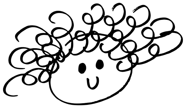
It's a smiley face. Hand-drawn. Curly hair. Big grin. That's it. That is my signature that has now become my personal logo.
No sleek typography. No carefully chosen color palette. In fact, I tried working with a designer to make something more "professional", more reflective of what I saw other business owners doing but it further reinforced what I always knew... I've got to stick to the doodle. The same one I've been drawing since high school..
I started sketching it in the back of notebooks sometime around junior or senior year. It just kind of happened. A little smiley face with wild curly hair that looked like me. I'd sign notes with it. Scribble it on papers. It became my thing.
Then I kept doing it in college. And when I started Ocaquatics Swim School. And for the next 30 something years after that.
I once tried to sign a bank document with it. The banker was not amused. Apparently smiley faces don't count as legal signatures. Who knew?
But here's why I love it and why I've never replaced it with something more “polished."
That little doodle is me. It's positive. It's a little quirky. And it makes people smile, which is kind of the whole point.
When I look around at the logos in the business world, especially in the thought leadership and speaking space, everything looks the same. Clean lines. Muted colors. Very serious. And after a while, they all kind of blend together.
My smiley face with the curly hair? Nobody forgets that. People see it and they instantly get a sense of who I am before I've said a single word and no branding agency could replicate that in the same way. That I'm approachable and I'm fun. And while I take what I do seriously, I take myself lightly. And I'm going to authentically share the real ups and downs of building a business over three decades.
I think your brand should feel like you. Not like a version of you that's been filtered and polished and boardroom-approved until all the personality has been sucked out of it.
I built a swim school from a hotel pool into an employee-owned, certified B Corp. We have taught over 3.2 million swimming lessons and we are just getting started! I turned down private equity. I did things differently my entire career. So why would my personal logo now be any different?
If you're starting something new, or reinventing yourself, or stepping into a new chapter, here's my advice: don't overthink the branding. Find the thing that's authentically you, even if it's a little weird, even if a banker frowns at it, and lean in all the way.
My doodle has outlasted every trend, every rebrand suggestion, and every well-meaning graphic designer who offered to "upgrade" it.
Some things don't need upgrading. They just need to be unapologetically themselves.
Just like that curly-haired girl who drew it.